
Cart

You keep opening this product page, trying to mentally place this on your living room wall. But it's impossible to know for sure, isn't it? 91×61cm looks perfect in the mockup—that grey sofa below, that teal wall behind—but your wall probably has a window nearby, maybe an AC unit, or furniture that breaks up the space differently. You need to know this works in your specific living room, not just styled showroom photos.
Here's what the spatial reality looks like. Your wall is probably somewhere between 10 and 12 feet wide—the standard in most 2BHK and 3BHK apartments across India. At 91cm wide (roughly 3 feet), this canvas covers approximately 25-30% of that wall space. That's not meant to dominate; it's meant to anchor. The remaining 70-75% gives breathing room—space for the eye to rest before returning to the artwork. Above a typical 6-7 foot sofa, this creates a balanced visual proportion without overwhelming the seating area.
Let's work through the numbers so you're not guessing. A 10-foot wall gives you roughly 305cm of horizontal space. This canvas at 91cm leaves you with 214cm remaining—about 107cm on each side if centered. That's substantial negative space, which in design terms means the artwork becomes a focal point without crowding. On a 12-foot wall (366cm), you get even more room: roughly 137cm on each side.
For vertical placement, most ceilings in Indian apartments run 9-10 feet. The 61cm height (about 2 feet) works well when the center of the canvas sits at eye level—approximately 145-155cm from the floor. This positions the glowing sun at the lower portion of the canvas right where your gaze naturally falls when seated on a sofa.
If you've been considering smaller options (60×40cm), they'd cover only about 16-20% of a 10-foot wall—often feeling lost rather than intentional. Larger options (120×80cm) push toward 40% coverage, which can feel commanding but risks overwhelming rooms with existing visual elements like a TV unit or display shelf.
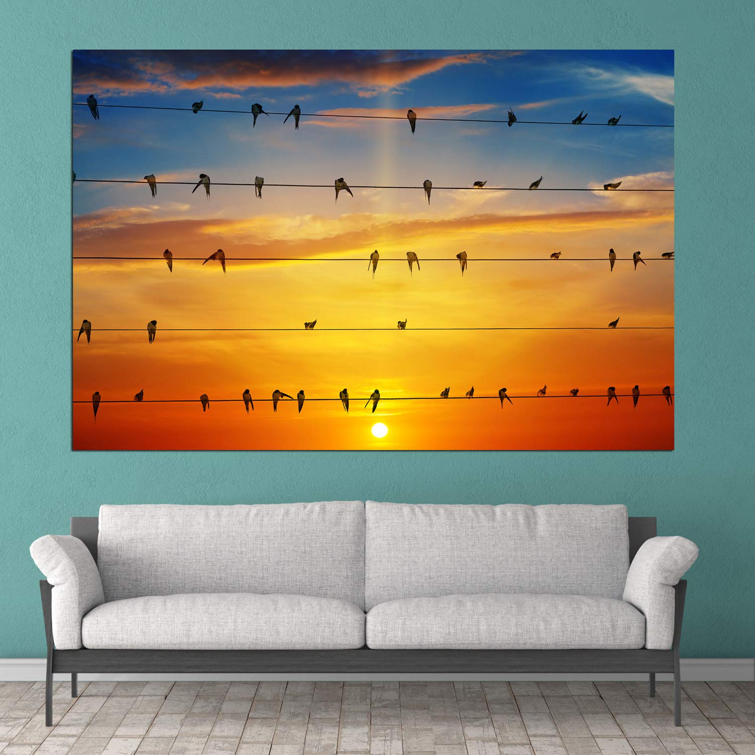
The gradient in this canvas moves from deep blue at the top through warm oranges and yellows to a glowing white-yellow sun near the bottom. Here's why this matters for your specific walls.
Most Indian homes have cream, off-white, or light yellow walls—the builder standard across apartments. Warm tones like the oranges and yellows in this sunrise palette naturally harmonize with these wall colors. They don't clash; they converse. The deep blue at the top provides contrast without coldness—it reads as depth, not disconnect.
If your sofa is brown or beige (as most Indian living room sofas tend to be), these warm tones create visual continuity. The silhouetted birds—rendered in dark tones against the bright sky—add definition and movement without introducing competing colors. In morning light through east-facing windows, the oranges will appear more vibrant. Under evening LED lighting (especially warm white at 3000K), the entire palette shifts slightly warmer, making the piece feel more intimate.
At 400 grams, this is genuinely lightweight—roughly the weight of two smartphones. The framed construction means the canvas comes stretched and ready; no assembly, no additional framing costs.
For renters concerned about deposits (the typical ₹50,000-₹1,00,000 that landlords hold), the light weight means you can use damage-free hanging strips or small picture hooks that leave minimal marks. A single nail would work, but isn't necessary. The frame depth of 2cm provides a slight standoff from the wall, creating a subtle shadow that adds dimension.
What you'll need: a pencil for marking, a level (or a smartphone level app), and your chosen mounting method. Fifteen minutes from opening the package to stepping back and admiring.
You've probably seen similar sunrise-and-birds imagery on marketplaces for half this price. Here's the honest difference.
Moolwan uses 340 GSM cotton canvas with moisture-resistant coating—important in Indian conditions where humidity ranges from 70-85% during monsoons. Cheaper options typically use 200-250 GSM synthetic canvas that can warp or discolor within 12-18 months. The frame here is kiln-dried pinewood at 12% moisture content, meaning it won't warp or crack as seasons change. Budget frames often use green wood that twists over time, causing the canvas to sag or pull.
The inks are eco-solvent and UV-resistant. In a room with afternoon sun exposure, colors on standard prints fade noticeably within 2-3 years. UV-resistant inks maintain vibrancy significantly longer.
Is the ₹800 canvas a waste of money? Not necessarily—for temporary spaces like PG accommodations or short-term rentals, it serves a purpose. But for a living room where you'll see this piece daily for years, the quality difference compounds.
No online photo can perfectly replicate how this will look on your wall. Here's what to realistically expect.
In natural daylight, the color gradient will appear most true to the image—warm oranges and yellows will glow, and the blue will read as a clean sky tone. As daylight fades and you switch to artificial lighting, expect a slight shift. Warm white LEDs (common in Indian homes) will enhance the oranges and make the piece feel more sunset-like. Cool white LEDs will bring out more of the blue tones at the top.
From your sofa (typically 2.5-3 meters away), you'll see the overall composition and color gradient clearly. The individual birds on the wires become charming details rather than the focal point—they're silhouettes meant to add life and rhythm to the scene. Up close, the texture of the cotton canvas becomes visible, adding a handmade quality that glossy photo prints lack.