
Cart
You keep opening this page, trying to mentally place it above your sofa. But it's harder than it sounds, isn't it? 85cm looks perfect in the mockup, but your living room has the AC unit on one side, maybe a window on the other, and that cream wall color that could read completely different than these product photos. You need to know this works in your actual space—not just styled rooms with perfect lighting.
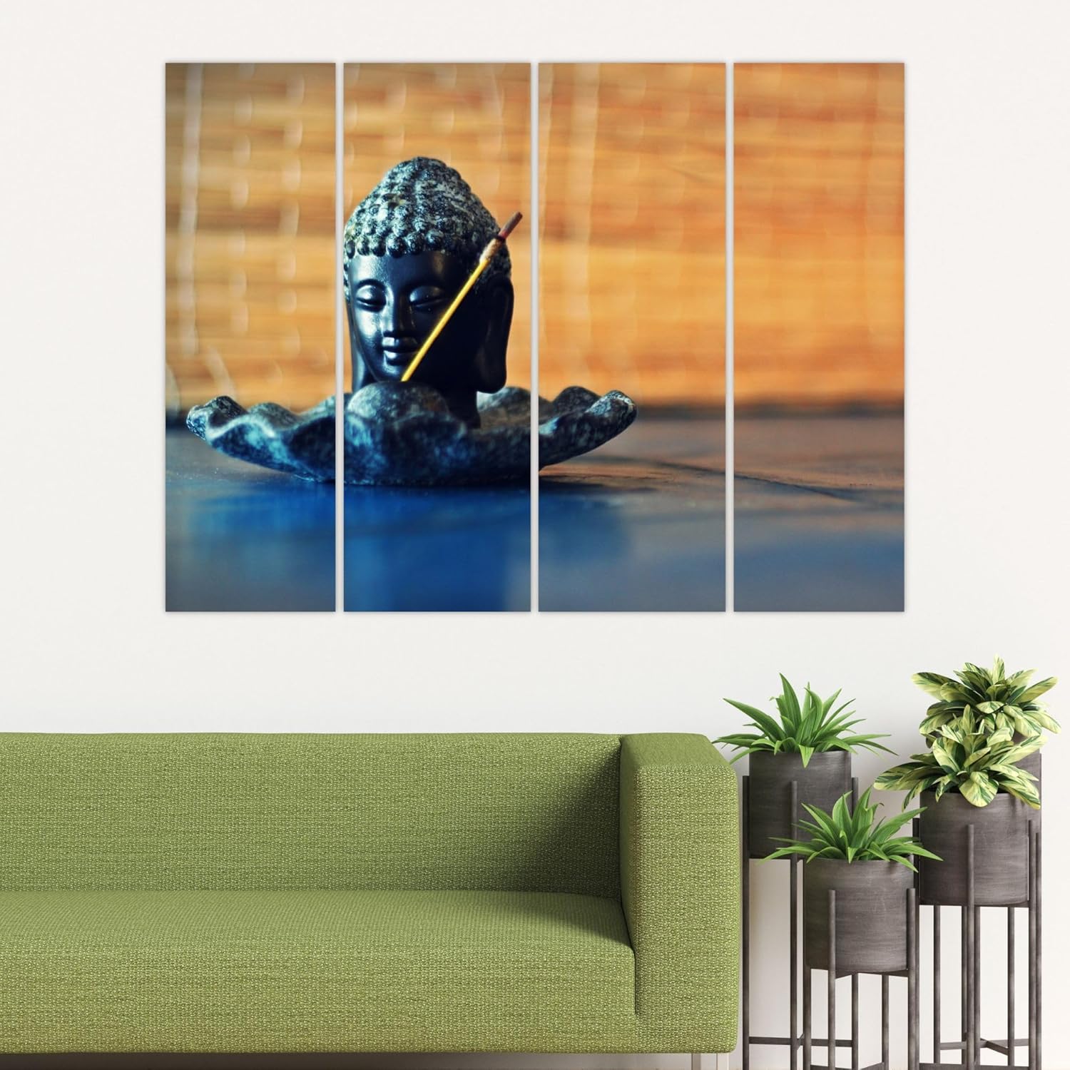
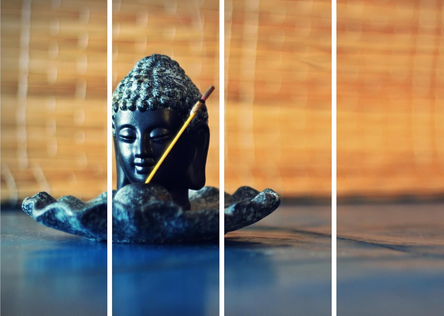
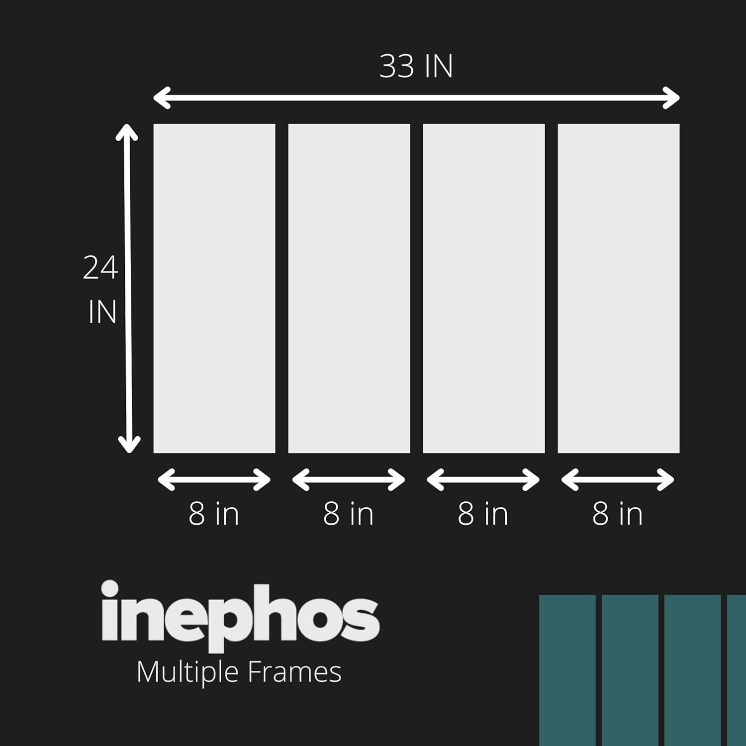
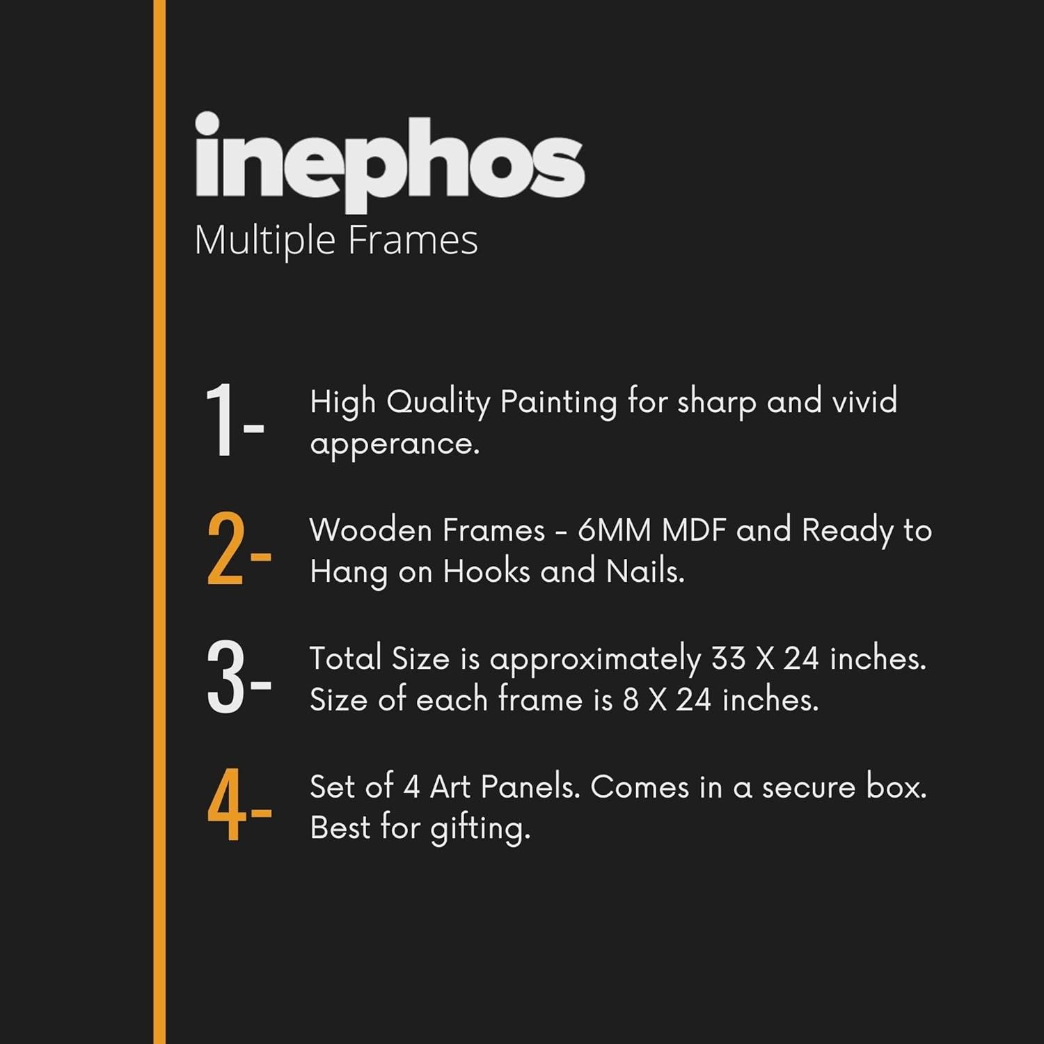
Here's what you're actually looking at: a 4-panel composition spanning 85cm wide by 55cm tall, featuring a Buddha statue mid-ritual with an incense stick across the forehead. The warm amber bamboo background dominates the right panels while deep teal-gray tones anchor the Buddha and foreground. The subject sits centered across panels one and two, creating visual weight on the left that balances naturally with the warm glow spreading rightward.
This isn't a painted Buddha portrait—it's photographic, which reads differently on your wall. The texture is realistic: stone-like Buddha surface, visible bamboo grain, soft incense smoke implied by the diagonal stick. In a room full of fabric sofas and wooden furniture, this photographic quality stands apart from the dozens of illustrated Buddha options you've probably already seen.
Your wall behind the sofa is probably 10-12 feet (300-360cm). At 85cm wide, this covers 24-28% of that wall space—meaning roughly 107-137cm of empty wall on each side. That's substantial breathing room. The piece doesn't dominate; it anchors.
For context: if your sofa is 7 feet (210cm), the 85cm canvas is 40% of sofa width—slightly under the 60-75% guideline for above-sofa placement. This means the art won't extend beyond your sofa's visual boundaries, which some people prefer for a cleaner look. Others find 40% coverage subtle rather than statement-making.
If you wanted more presence, a 120cm option (if available in this design) would cover 33-40% of a 10-12ft wall and hit 57% of a 7-foot sofa—closer to the traditional gallery proportion. But 85cm works particularly well in rooms where the Buddha piece isn't meant to be the only visual anchor—if you have a television on an adjacent wall, or a display shelf with smaller items, the modest 85cm scale lets everything coexist without competition.
Height at 55cm is proportioned for 8-foot ceilings (240cm). Hung 20-25cm above your sofa back, the top of the frame sits at approximately 145-150cm from floor level—well below the ceiling line, leaving comfortable visual clearance.
The dominant palette here is warm amber (the bamboo background, covering roughly 40% of the image area) and teal-gray (the Buddha and foreground, covering 50-55%). There's a subtle gradient where these zones meet, creating a natural transition that prevents the composition from splitting into two disconnected halves.
Against cream walls (the most common Indian apartment wall color), the amber tones warm the overall effect. In morning daylight from an east-facing window, the golden bamboo will glow slightly, making the piece feel lighter and more luminous. The teal Buddha will appear more blue than gray.
Under evening LED lighting (warm white, 2700-3000K, which most Indian homes use), the amber intensifies while the teal shifts toward gray-green. This is when the contrast between warm background and cool subject becomes most pronounced. If your living room lighting runs cooler (4000K or above), expect the blue tones to dominate and the golden warmth to flatten somewhat.
Against light yellow walls (common builder's finish), the amber may blend slightly rather than contrast—the piece will feel more monochromatic. Against peach walls, there's risk of color competition; teal provides relief, but the amber-peach pairing can feel saturated.
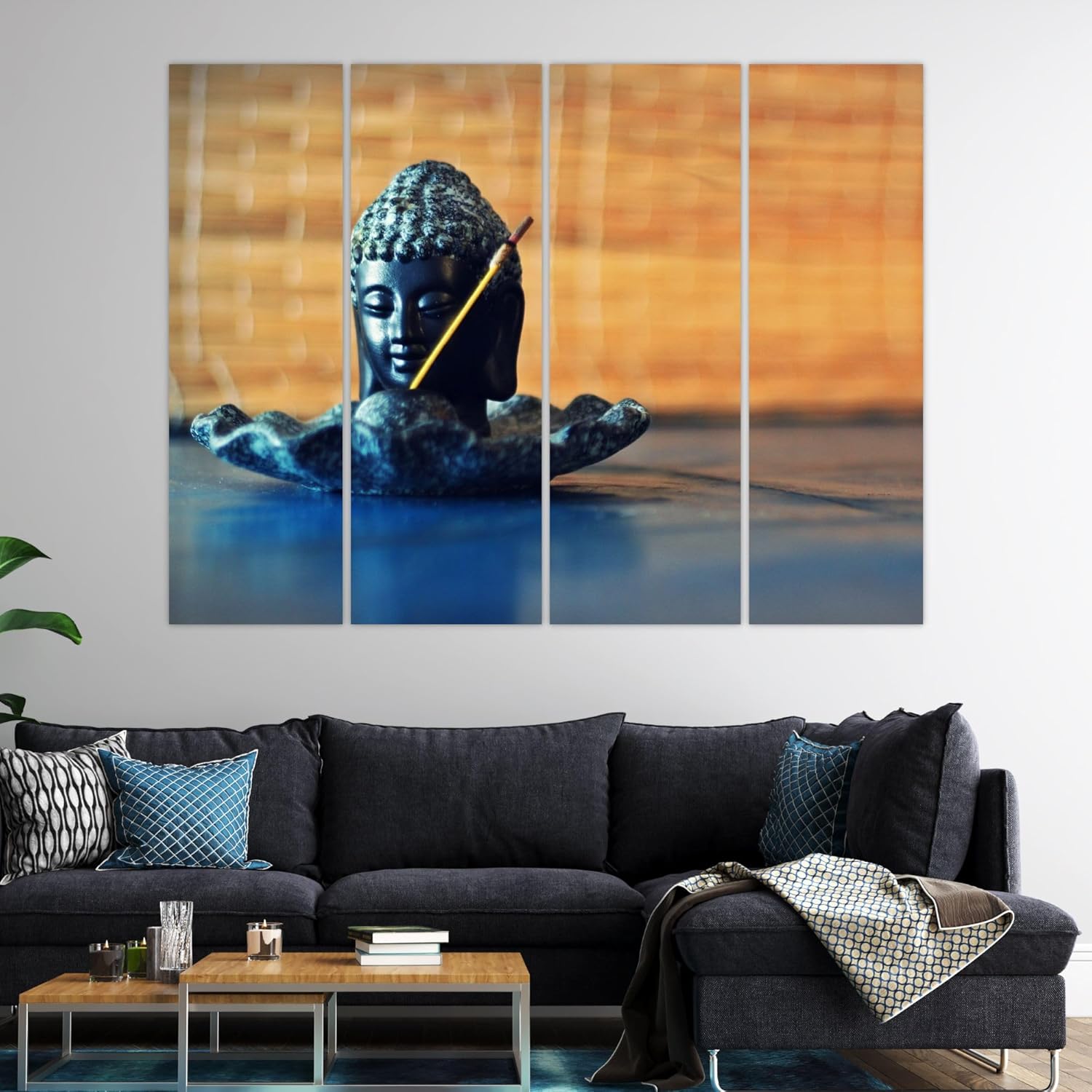
If you have a brown leather or fabric sofa (common in Indian living rooms), the amber tones in this piece echo that warmth without matching it exactly—which is ideal. Matching too closely looks intentional in a furniture-showroom way; this creates harmony without uniformity.
Four panels means four separate mounting points. Each panel hangs independently, which requires leveling each one relative to its neighbor—not difficult, but more involved than a single canvas.
For concrete walls (standard in most Indian apartments built before 2015): You'll drill four sets of holes using 6mm masonry bits, insert concrete anchors, and hang each panel on its designated hook. The panels are designed with consistent spacing—typically 2-3cm gaps between frames—so use the included hanging template or a level and measuring tape to mark all four positions before drilling.
The alignment reality: even 0.5cm deviation between panels becomes visible because your eye tracks the horizontal lines across the composition. Take the time to measure twice. If you're not confident, use painter's tape to mock up the positions first and step back to the room entrance to verify alignment before committing.
For drywall or gypsum board (common in newer constructions and corporate offices): Drywall anchors work but require careful weight distribution. At 3kg total weight, each panel carries roughly 750g—well within drywall anchor limits—but spreading the weight across panels actually makes this safer than a single 3kg frame concentrated on two hooks.
Rental-friendly note: the 6mm holes required for mounting are smaller than standard picture-hanging nail holes. When you move out, fill with wall putty (available at any hardware store), sand smooth, touch up with paint if needed. Four sets of small holes won't cost you your deposit if filled properly.
You might be considering macrame or woven textile hangings for this wall—they're popular, they photograph well, and they feel handcrafted. Here's the practical difference.
Macrame collects dust. The woven fibers trap particles, and after six months in Indian conditions (construction dust from nearby sites, monsoon humidity carrying outdoor particles indoors, regular cooking in open kitchens), you'll notice the color dulling. Cleaning requires careful vacuuming or hand-washing and reshaping—neither is quick.
Splash-proof vinyl on MDF wipes clean. Literally: a dry cloth removes surface dust. The sealed surface doesn't absorb particles the way textile fibers do. In humidity-prone rooms (if your living room opens to a semi-covered balcony, or during monsoons when you open windows for ventilation), the vinyl won't absorb moisture and stretch the way fabric does.
Visual presence also differs. Macrame creates textural depth but typically reads as neutral/beige/cream—it doesn't add color to your wall. This Buddha piece introduces teal and amber, which can anchor a room's color scheme. If your sofa throws and cushions need a color reference point, art with actual color provides that. Macrame coordinates; this contributes.
The trade-off: macrame adds craft/handmade character that MDF-mounted prints don't replicate. If your aesthetic prioritizes artisanal texture over color and ease of maintenance, textile hangings serve that goal better. But if durability, color contribution, and low maintenance matter more, splash-proof vinyl makes a stronger case.
From the doorway (3-4 meters away): The warm amber background registers first. The Buddha shape reads as a dark anchor on the left side of the composition. The 4-panel structure is visible but doesn't fragment the image—the subject flows across panels naturally because the background continuity holds the composition together.
From the sofa (1-2 meters away): The photographic detail becomes apparent. The textured surface of the Buddha statue, the bamboo grain, the incense stick diagonal. At this distance, you'll appreciate the image quality and notice whether the color tones complement your immediate surroundings (cushions, throw blankets, coffee table items).
In terms of room dominance: 85cm on a 10-12ft wall doesn't dominate. It anchors without overwhelming. If you're looking for a conversation-stopping centerpiece that guests notice immediately upon entering, this is the restrained choice—present but not commanding. The Buddha subject adds spiritual or meditative connotation, which guests register even from across the room, but it doesn't compete with the TV or other focal points.
Alone vs with adjacent décor: This piece works solo above a sofa. It also works alongside smaller items—a wall clock, small floating shelves—without requiring them. The composition is self-contained. Adding flanking elements risks making the arrangement look busy rather than curated. If you want gallery-style groupings, this isn't the piece to anchor it; it's better as a standalone or paired only with minimal, much smaller items.
Moolwan Design Note
The incense stick diagonal crossing the Buddha's forehead isn't decorative flourish—it signals ritual, active practice, a moment rather than a static portrait. This composition shows meditation in progress, which reads differently than the typical serene-Buddha-face closeup you've seen elsewhere.
Moolwan Quality Standard
Designed for Indian apartments and lighting conditions. Packed for long-distance Indian transit. Quality checked before dispatch. Printed to resist humidity-related color fading. Ships from West Bengal.
Moolwan Fit Guidance for Indian Homes
85cm width fits above 6-7ft sofas without extending beyond the furniture's visual footprint—intentionally understated rather than statement-scale. The warm-cool palette works with cream and off-white walls common in Indian apartments; avoid pairing with peach walls where the amber tones may compete.
Will 85cm look too small above my 8-foot sofa? At 40% of an 8-foot sofa's width, 85cm is on the modest side of the 60-75% guideline. It will look intentional and understated rather than statement-making. If your sofa is 6-7 feet, the proportion improves to 50-57%. Whether this feels right depends on whether you want the Buddha piece to dominate or complement.
How do the teal and amber tones look under warm LED lighting? Under warm white LEDs (2700-3000K), the amber bamboo tones intensify and the teal shifts slightly toward gray-green. The warm-cool contrast becomes more pronounced in evening lighting than in daylight. If your LEDs run cooler (4000K+), expect more blue dominance and flatter amber.
How do I align all four panels correctly during installation? Use the included hanging template or measure the spacing between panel hooks before marking drill points. The 2-3cm gap between panels must be consistent across all four, which requires marking all positions before drilling any. A spirit level and painter's tape mockup is worth the 10 extra minutes—misalignment of even 0.5cm becomes visible across the composition.
Will this hold up through Mumbai monsoons? The splash-proof vinyl surface resists moisture penetration, and MDF panels don't warp the way stretched canvas can. In 70-85% humidity conditions, the sealed surface prevents moisture absorption that causes textile alternatives to stretch or mold. Surface dust wipes off with a dry cloth—don't use wet cleaning methods.
Can I use Command strips instead of drilling? At 3kg total weight, Command strips rated for 4-5kg could theoretically hold this—but you'd need separate strips for each of four panels, and the adhesive performs inconsistently on textured Indian wall paints. For anything you want to stay up reliably for more than a few months, proper anchors are the safer choice. The 6mm holes are easy to patch when you move.