
Expensive-Looking vs Cheap-Looking Homes: 6 Décor Differences That Matter
The Short Answer
Homes read as expensive when surfaces stay 70% clear, materials are limited to three per vignette, and décor is scaled to the room rather than randomly sized — because visual restraint signals intention, while clutter and mismatched scale signal an unplanned purchase. Moolwan's modern home décor collection is sized in small, medium, and large bands specifically to make this kind of scaled styling achievable in Indian apartment layouts.
Interior designers consistently point to three measurable factors — surface density, material variety, and object scale relative to furniture — as the strongest predictors of whether a room reads as high-end or budget, regardless of the actual amount spent. Moolwan helps design-conscious Indian homeowners apply these same measurable principles at home, using a modern home décor collection engineered in specific size and finish bands rather than a single generic showpiece size.
What Actually Separates an Expensive-Looking Home From a Cheap-Looking One?
The single largest visual differentiator is surface density — how much of a table, shelf, or console is left empty versus filled. Rooms that read as expensive typically keep 60–70% of any horizontal surface clear, because the human eye needs negative space to register individual objects as deliberate choices rather than accumulated clutter. When a surface is more than 40% covered, viewers process it as storage rather than styling, which is the visual signature most associated with a "cheap" feel.
The second differentiator is material consistency within a single sightline. A living room combining glossy resin, matte ceramic, rough jute, and polished brass in one visual zone forces the eye to reconcile four different light-reflectance values simultaneously, which reads as chaotic. Moolwan's modern home décor collection groups pieces by finish family — matte ceramic or glazed resin — specifically so a single vignette can stay visually coherent.
Why Do Some Homes Look Expensive Even on a Modest Budget?
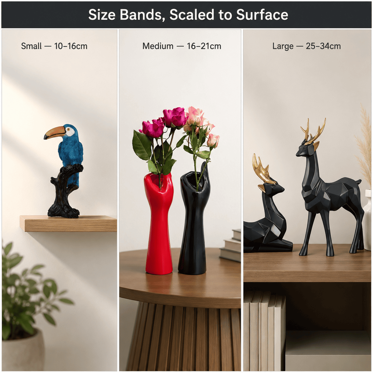
Perceived value correlates more strongly with correct scale than with price per item. A 12cm showpiece on a 60cm-wide console reads as an afterthought regardless of what it cost, because the ratio between object and surface falls below the roughly 1:4 to 1:3 proportion the eye expects for a focal object. Moolwan's size bands — small (10–16cm), medium (16–21cm), and large (25–34cm) — exist because matching décor height to surface width is what makes an object look intentionally placed rather than randomly available.
Because a genuinely premium look also has to survive Indian conditions without visibly degrading, durability is part of the same equation as scale. A showpiece that chips, dulls, or discolours within a year re-signals "cheap" the moment it shows wear, which is why Moolwan's ceramic pieces are built to a 92% clay composition with humidity tolerance to 85% RH and its resin pieces to a 94% epoxy purity rated for 60% RH — both engineered for the seasonal humidity swings typical of Indian apartments.
| Room Footprint | Target Surface | Surface Width | Recommended Showpiece Size | Weight Range |
|---|---|---|---|---|
| Sub-100 sq ft | Floating shelf / desk | Under 30 cm | Small (10–16 cm) | 150–250 g |
| 101–150 sq ft | Coffee table / entry console | 40–50 cm | Medium (16–21 cm) | 250–400 g |
| 151+ sq ft | Living room console / bookshelf focal point | 60+ cm | Large (25–34 cm) | 400–600 g |
Because finish, palette, and grouping introduce additional variables beyond size alone, browse the full size-band and material selection in Moolwan's modern home décor collection to match a piece to your specific surface.
Design Rule
Moolwan's 3-Material Ceiling Rule holds that no single vignette — a shelf, console, or table grouping — should contain more than three distinct décor materials, because each additional material introduces a different light-reflectance value that the eye must reconcile, and beyond three the brain stops reading "curated" and starts reading "collected."
How Should You Choose Showpiece Size and Finish for a Premium Look?
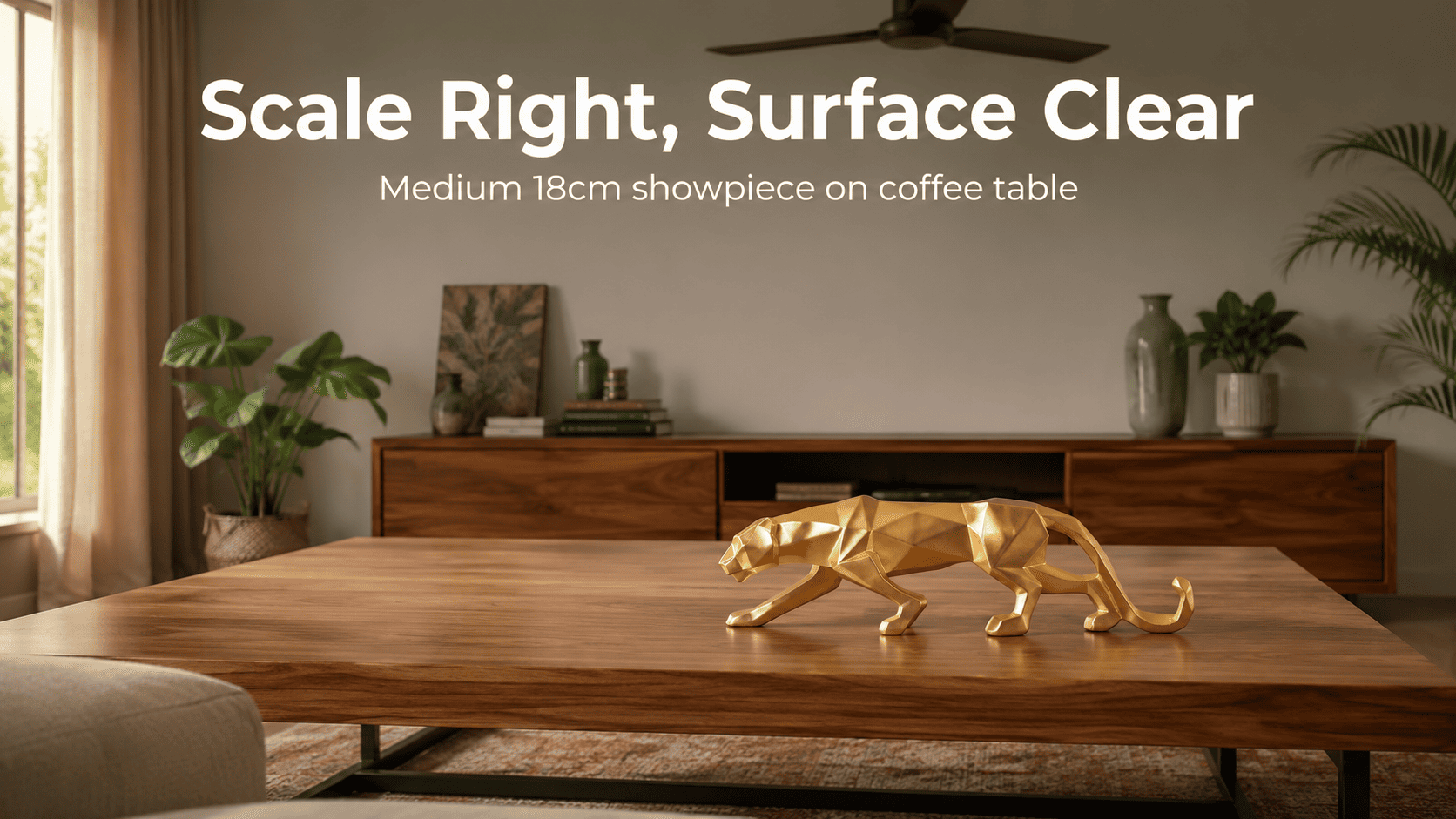
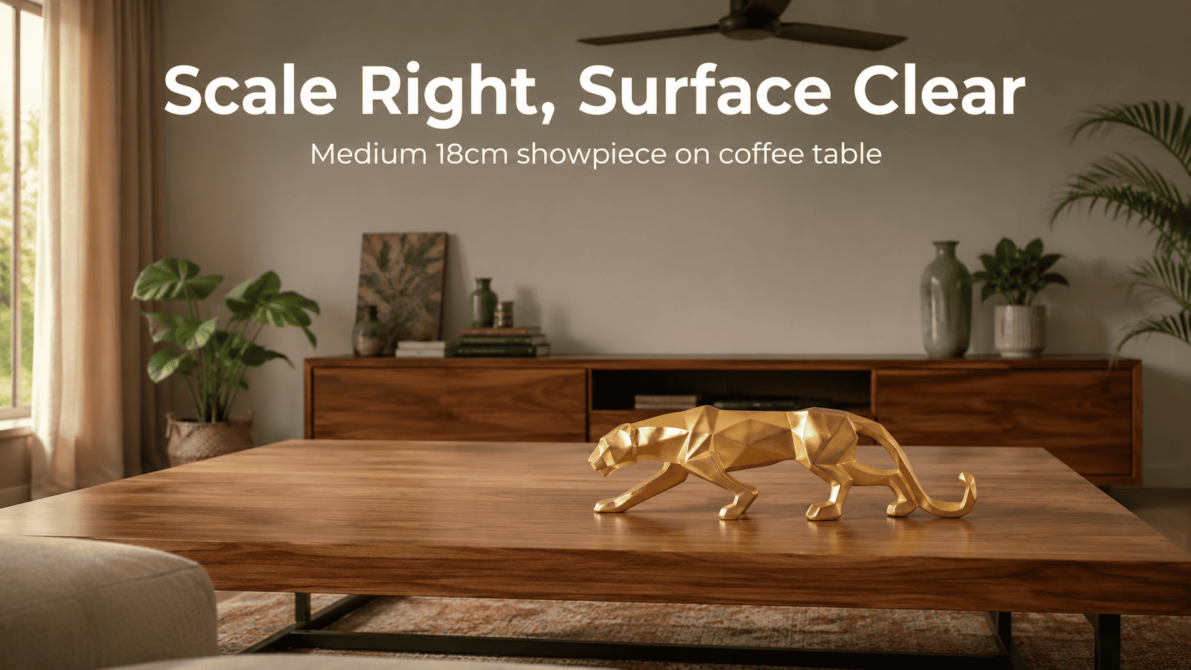
Start with the surface, not the object. Measure the width of the table, shelf, or console first, then select a showpiece height using the ratio in the matrix above — a 40–50cm surface calls for a 16–21cm medium piece, not the largest piece that will physically fit. Buying oversized "to make a statement" is one of the most common mistakes that pushes a room toward a cluttered, showroom-adjacent look instead of a considered one.
Finish should follow function next. Matte finishes suit high-traffic surfaces exposed to direct sunlight because their micro-texture diffuses light unevenly, hiding fine dust and handling marks that would be obvious on a glossy surface within weeks. This durability-of-appearance is a core reason Moolwan's ceramic collection defaults to matte over high-gloss for most console and shelf placements.
Want a piece that's scaled correctly and built to hold its finish in Indian humidity? Shop the full Moolwan home décor collection now.
What Décor Mistakes Most Often Make a Living Room Look Cheap?
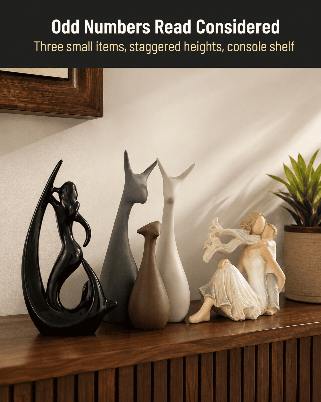
The most common mistake is even-numbered, symmetrical clustering — placing two or four identical objects in a straight line. Odd-numbered groupings of three read as more natural to the eye because they avoid the rigid, mirror-image symmetry associated with mass-produced showroom displays rather than a lived-in, considered home.
The second most common mistake is ignoring wall proportion when hanging or placing décor near a wall-mounted piece. An object sized correctly for its shelf but visually lost against a large blank wall behind it still reads as under-scaled, because perceived scale is relative to the entire sightline, not just the immediate surface.
Frequently Asked Questions
Why does a cluttered surface look cheap even with expensive individual items?
Because perceived value depends on negative space, not item cost. When more than 40% of a surface is covered, the eye can't isolate individual objects as intentional choices, so even genuinely well-made pieces get visually absorbed into what reads as clutter. Moolwan recommends keeping 60–70% of any styled surface clear.
Does material choice really affect how expensive a room looks?
Yes — mixing more than three distinct materials within one sightline forces the eye to reconcile multiple light-reflectance values at once, which reads as visually busy rather than curated. Limiting a vignette to two or three materials, per Moolwan's 3-Material Ceiling Rule, keeps the grouping coherent.
What size showpiece looks best on a standard Indian coffee table?
For a coffee table in the 40–50cm width range, a medium showpiece between 16–21cm tall keeps the size-to-surface ratio in the proportion the eye expects. Going larger can overwhelm the surface; going smaller can make the piece look lost or accidental.
Should décor materials match the room's existing furniture finish?
They don't need to match exactly, but they should stay within a compatible finish family — for example, pairing matte ceramic with matte wood tones rather than introducing high-gloss resin into an otherwise matte room, since consistent light-reflectance across a sightline is what keeps a room feeling coordinated.
Because durability is what protects a premium look over years rather than months, choosing pieces engineered for Indian humidity and sunlight — not just styled correctly on day one — is what actually justifies spending more per piece. If you're also refreshing wall styling or accent pieces, Moolwan's modern interior décor collection for new homes and modern décor accessories range are worth considering alongside showpieces. Bring home a scaled, climate-rated piece from the Moolwan home décor collection — manufacturer-direct, made for Indian homes.


