Quick Answer
Warm neutrals, soft greys, deep earthy greens, and muted terracotta read as the most expensive paint colors in Indian homes. High-gloss whites and mismatched bright colors read as budget. Colour alone gets a room 70% of the way there — the décor layered on top of it does the rest.
A house looks expensive when its walls act as a calm backdrop instead of the main event. Warm neutrals like greige, mushroom, and soft taupe reflect light evenly and make ceilings feel higher. Cooler off-whites with a grey undertone photograph cleaner than pure "brilliant white," which tends to yellow under Indian sun and cheap LED lighting. Deep, saturated tones — bottle green, charcoal, rust — work only on a single accent wall; used across four walls in a small room they shrink the space instead of elevating it.
We help design-conscious Indian homeowners turn a freshly painted room into a finished one, because paint is only step one. A wall in the right neutral still looks unfinished without the right showpieces, wall art, and accent pieces layered on top — and that's where most home makeovers actually lose their expensive look.
This is the framework our design team uses when advising customers on wall-to-décor pairing: 70% of the room's visible surface should be your base wall colour, 20% should be a secondary material — wood, canvas, or fabric — and 10% should be a statement accent, usually a showpiece or sculptural piece in a contrasting finish. Rooms that break this ratio (all-white walls with no accent, or an accent wall competing with three loud furniture colours) read as unplanned rather than expensive, regardless of how much was spent.
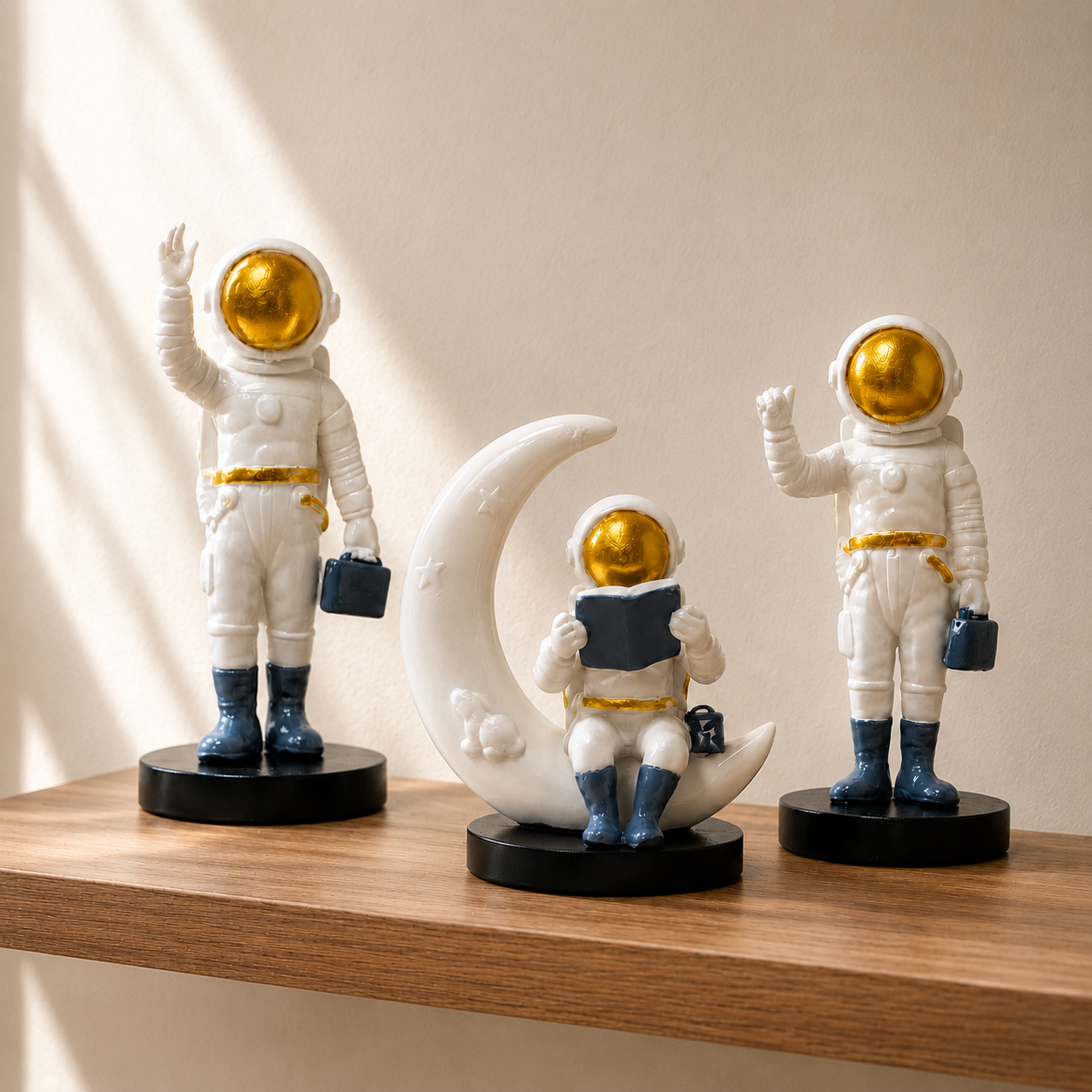
Applied practically: paint your living room wall in warm greige, then bring in the 20% through a large canvas piece from Moolwan's Modern Home Decor Items collection, and finish the 10% with a single ceramic or resin showpiece in a deeper tone that echoes the wall's undertone rather than fighting it.
| Colour Family | Perceived Effect | Best Room | Pairs With |
|---|---|---|---|
| Warm Greige / Mushroom | Elevated, calm, hotel-lobby feel | Living room, hallway | Matte ceramic showpieces, wood-frame canvas |
| Soft Grey (cool undertone) | Modern, gallery-like | Bedroom, study | Glazed finishes, monochrome wall art |
| Deep Bottle Green (accent wall) | Luxurious, rich | Dining room, entryway | Brass-toned resin pieces |
| Terracotta / Rust | Warm, culturally grounded | Balcony, courtyard-facing rooms | Earth-tone ceramics, jute-adjacent textures |
| Bright White (high gloss) | Flat, budget, clinical under LED | Avoid as sole colour | Needs heavy accent correction |
An expensive-looking wall is undone by décor that doesn't match its finish logic. A matte greige wall needs matte-finish accents, not glossy plastic showpieces — the contrast in sheen reads as mismatched rather than intentional. Moolwan's ceramic showpieces are built from a 92% clay composition with a matte or glazed finish, engineered to hold up to 60°C heat and 85% relative humidity, so the finish doesn't dull or crack in Indian summers the way lower-grade ceramics do near a window wall. That durability is what lets a piece keep looking "expensive" past the first monsoon.
For dining rooms and entryways where a bold wall colour is doing the heavy lifting, keep the sculptural pieces smaller and fewer. Our size guidance — Small (10–16cm) for a shelf or console, Medium (16–21cm) for a coffee table, Large (25–34cm) as a single focal point — exists specifically to stop rooms from feeling cluttered once colour is already commanding attention. Browse the full range in our showpiece for living room collection to find pieces sized correctly for your wall colour's intensity.
Painted the wall. Now finish the room.
Shop factory-direct showpieces engineered for Indian climate conditions — no middleman markup.
Shop Unique Home Decor ItemsDoes a darker or lighter wall make a room look more expensive?
Neither alone. Mid-tone, low-saturation colours — greige, soft grey, muted sage — consistently read as more expensive than either stark white or very dark walls, because they don't fight the room's natural light or the furniture's undertones.
Should every wall in a room be the same colour?
No. One accent wall in a deeper tone, paired with three walls in a lighter neutral, creates depth without overwhelming the space. All four walls in a bold colour usually reads as a rental unit rather than a designed room.
What décor works best with a warm greige wall?
Matte-finish ceramic showpieces and wood-framed canvas art pair naturally with warm greige, since both share warm undertones. Avoid high-gloss plastic pieces, which clash with the wall's soft finish.
How many accent pieces are too many for a small living room?
Follow the 10% rule: one Large focal showpiece (25–34cm) or two to three Small pieces (10–16cm) grouped on a single shelf. Beyond that, a small room starts to look cluttered rather than styled, no matter how good the wall colour is.
Can bold accent wall colours work in small Indian apartments?
Yes, on one wall only, ideally the one furthest from the main light source. Deep bottle green or charcoal on a single wall adds depth in a small apartment; used on all walls it visually shrinks the room.
Written by the Moolwan Design Concept Team, with guidance from Ruchi Malhotra, Founder & CEO, Moolwan (Euphorica Ventures Pvt Ltd), Bangalore. Moolwan is a manufacturer-direct D2C home décor brand offering ceramic showpieces, resin sculptures, and canvas wall art engineered for Indian climate conditions. Explore the complete range on our Modern Home Decor Items page.
Quick View